Background
  • arrow_back Home
  • keyboard_arrow_rightuniform

uniform

trending_flat
[For The Uniform] The Pioneers: Mid 22nd Century

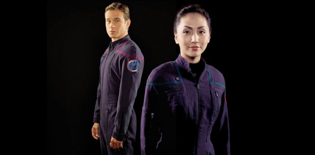
Giving us a glimpse of Starfleet's formative years, Star Trek Enterprise embraced a world before colourful uniforms, flashy computer panels and creature comforts all around. Set a century before Captain Kirk's five year mission and focused on the first line of Starfleet ships built to take on the final frontier, the show focused on Starfleet's first steps into becoming what we all knew and loved.... Offering a dramatic shift in visual identity, Enterprise took a massive step back from the comfortable styles of the Next Generation, and even further away from the colour coded optimism of the original series. Instead of bold colours and hidden zips, designer Robert Blackman took inspiration from his own century, using Enterprise's timeline to bridge the style gap between Kirk's era and our own.Taking inspiration from NASA's flight suits, Starfleet's were idealised as the next […]

trending_flat
[For The Uniform] The Next Gen Era ‘Working’ Uniform; 2360s-2370’s

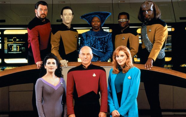
Complimenting the formal styles worn in the era on starships such as the USS Enterprise-D, Starfleet introduced a 'Type B' working uniform in the mid-late 2360's. With a looser and more relaxed fit, the working uniform was a standardised jumpsuit with darker tones used on facilities such as Deep Space Nine and later selected by many captains as standard dress across the fleet. Type B uniforms were a simplistic design compared to the Type A's worn by the Enterprise crew. A minimalist style, the base was a black jumpsuit typically worn with an open collar. The four-panel design was straight forward and simple, with internal waistband bringing in the fit at the waist while 'action pleats' were styled into the back for more ease of movement. The shoulder panels, mimicking the style of the Type A, would be coded to […]

trending_flat
For The Uniform: The Muted Tones of The Motion Picture

Starfleet's wardrobe always seems to change. Different producers and designers always bring something new to the table, whether it's a need to create a more militarised uniform, something nice and simple for a more real-world feel, or sometimes – just sometimes – space pyjamas. In the 1960s, colour television was all the rage and Star Trek was at the forefront of that huge leap in visual technology. It's outfits and set design were crafted to be bold and brash, resulting in the bright paintwork, scenes lit with vibrant pinks and purples and of course the now iconic division coloured uniforms. In both the planned launch of Phase II in 1978 and the earlier animated series in 1973, the iconic look of Starfleet was retained in all its bright and colourful glory. But when plans were scrapped and Paramount opted to […]

site2025m

Serving the fan community since 1974, SFC is an international not for profit fan organisation bringing together collective of fans collectively enjoying strange new worlds in science fiction media.

Star Trek and all related, derived or inferred ideas are the intellectual property of Paramount and Paramount Global. No infringement is intended in the use of this material. Starfleet Command Quadrant 2 (SFCQ2) does not generate any income or profit from their endeavours as a fan organisation, no part of which is sanctioned by the Paramount Global group or any sub-division of the legitimate copyright holders.

Core Website layout by Ghostpool. Managed and Maintained by Aim to Misbehave on behalf of Starfleet Command  Quadrant 2

© 2401 Starfleet  Command Quadrant 2 (SFCQ2)

Login to enjoy full advantages

Please login or subscribe to continue.

Go Premium!

Enjoy the full advantage of the premium access.

Stop following

Unfollow Cancel

Cancel subscription

Are you sure you want to cancel your subscription? You will lose your Premium access and stored playlists.

Go back Confirm cancellation